
Discover the best WCAG & ADA compliant WordPress themes.
Services, Public Institutions, School and other offers below are multipurpose WCAG & ADA compliant WordPress themes which means that they meet WCAG 2.0 (recently improved with WCAG 2.1 recommendations) and ADA requirements. Creating the site more accessible for people with disabilities is not an easy task. It demands to get familiar with the web content accessibility guidelines that are a collection of documents and includes tons of recommendations to build an accessible site.
The following features relate to all WCAG & ADA WordPress themes that you may find in PixelEmu's offer:
Main accessibility features
- The possibility to navigate the site using the keyboard
- Move through the page using the tab key
- Visibility of a selected item
- WCAG & ADA compliant backend options
- WCAG built in contrast modes
- Content headings
- Recently all WCAG & ADA WordPress themes have been updated to WCAG 2.1 latest recommendations
WCAG & ADA compliant WordPress themes
What should be the main features of the WCAG & ADA compliant website?
We do our best to meet all necessary WCAG requirements to make the theme passing WCAG accessibility verification checkers. Our WCAG and ADA WordPress themes are tested with most popular tools wave.webaim.org and achecker.ca - follow WCAG demo version for testing.
However, it's not about the theme code only. The website content is a very important issue that has a major impact on site accessibility overall. That's why while implementing a site content pay attention to the main four principles of availability.
How to follow WCAG recommendations for making web content more accessible in WordPress theme.
The possibility to navigate the site using the keyboard
The navigating through the site sections without the necessity of using a computer mouse but keyboard instead is the main and the very important feature for people with disabilities.
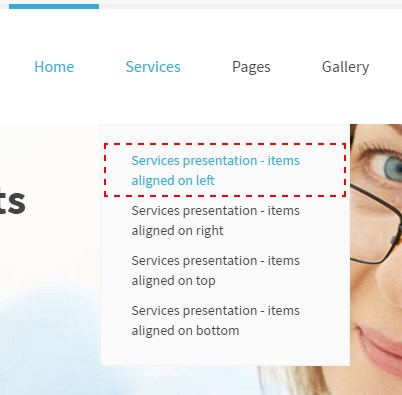
Move through the page using tab key
Skipping to the specific site sections using tab key let the user move through the page quickly. At the left top corner, you may set menu items allowing skipping to the specific site area.
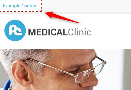
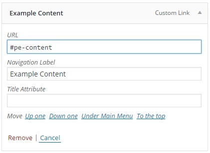
This is how it's set in the menu configuration.
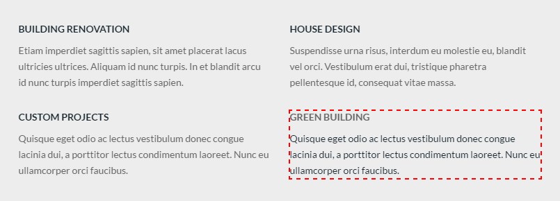
Visibility of a selected item
At any time the user needs to know on which an active element is located.
WCAG & ADA compliant backend options
Font size switcher (3 degrees of font size, which are fixed as a percentage).
Width switcher (fixed/fluid) adjust the width of the screen to fit your needs.
High contrast modes: ensure optimal readability of the text ( Black/White Mode, Black/Yellow Mode, Yellow/Black Mode)
Night mode (optional) - lets you avoid eyestrain. If your eyes get tired quickly, don’t strain them and to use night mode color version.
![]()
This is how you may configure the above options at the theme options.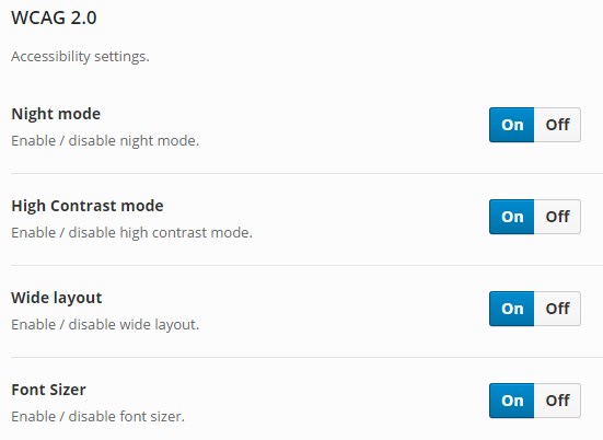
WCAG built in contrast modes
Black/White Mode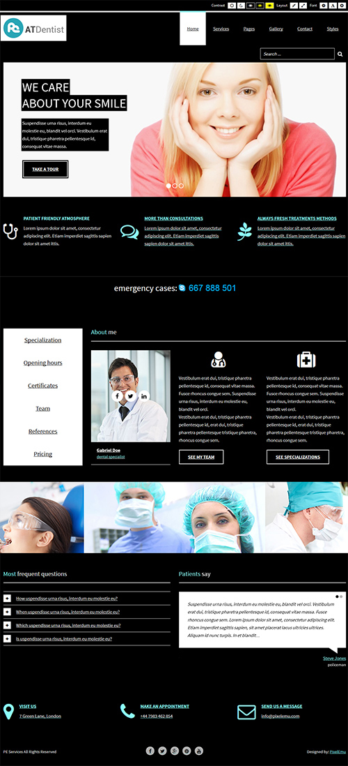
Black/Yellow Mode
Yellow/Black Mode
Night mode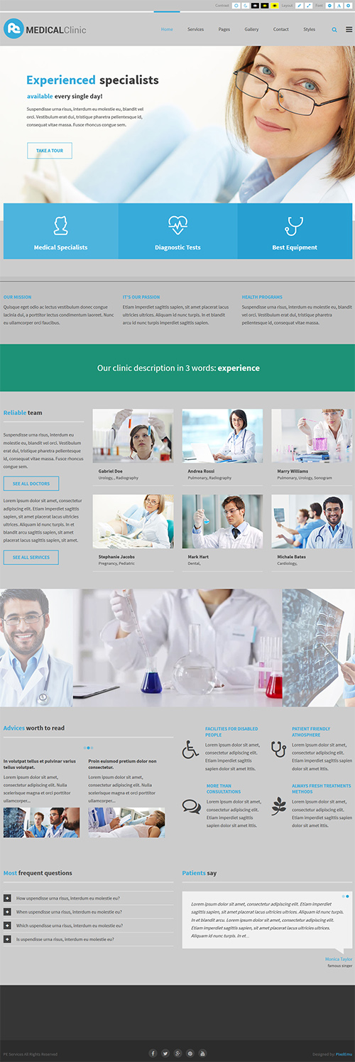
Content headings
Content should be organized with headings related to an accurate outline of the content.
It's helpful for people who use screen readers to browse the site.
This is how it looks at the theme options.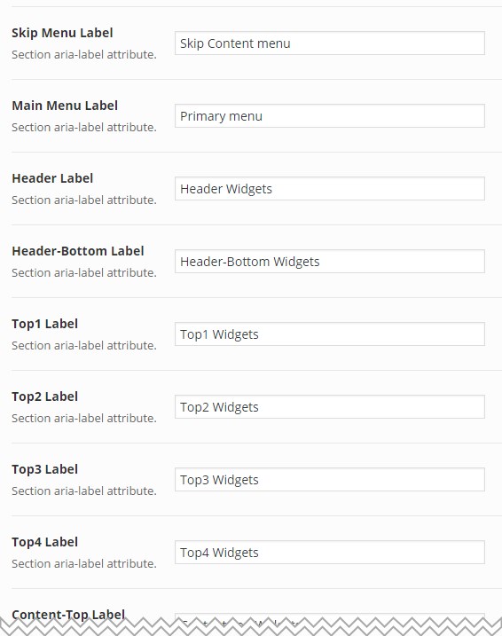
Other important criteria to include in theme coding:
- More requirements and useful info read here How to follow WCAG recommendations for making web content more accessible in WordPress theme.
WCAG 2.1 improvements for WordPress themes
For WCAG & ADA WordPress themes we implemented WCAG 2.1 features because WCAG 2.1 guidelines are officially recommended from June 2018.
- Added autocomplete attributes for a registration form, PE Contact widget, Contact page according to Success Criterion 1.3.5 Identify Input Purpose:
The purpose of each input field collecting information about the user can be programmatically determined when:
- The input field serves a purpose identified in the Input Purposes for User Interface Components section; and
- The content is implemented using technologies with support for identifying the expected meaning for form input data.
- Added button "Readable text" in WCAG font buttons to add letter-spacing: 0.12em and word-spacing: 0.16em to BODY according to Success Criterion 1.4.12 Text Spacing:
In content implemented using markup languages that support the following text style properties, no loss of content or functionality occurs by setting all of the following and by changing no other style property:
- Line height (line spacing) to at least 1.5 times the font size;
- Spacing following paragraphs to at least 2 times the font size;
- Letter spacing (tracking) to at least 0.12 times the font size;
- Word spacing to at least 0.16 times the font size.
Exception: Human languages and scripts that do not make use of one or more of these text style properties in written text can conform using only the properties that exist for that combination of language and script.

- Spacing following paragraphs to at least 2 times the font size according to Success Criterion 1.4.12 Text Spacing
In content implemented using markup languages that support the following text style properties, no loss of content or functionality occurs by setting all of the following and by changing no other style property:
- Line height (line spacing) to at least 1.5 times the font size;
- Spacing following paragraphs to at least 2 times the font size;
- Letter spacing (tracking) to at least 0.12 times the font size;
- Word spacing to at least 0.16 times the font size.
Exception: Human languages and scripts that do not make use of one or more of these text style properties in written text can conform using only the properties that exist for that combination of language and script.
- Added role "status" for notices in PE Contact widget, Contact page according to Success Criterion 4.1.3 Status Messages
In content implemented using markup languages, status messages can be programmatically determined through role or properties such that they can be presented to the user by assistive technologies without receiving focus.
- Darker background for controls in PE Testimonial Carousel, PE Image Coverflow according to Success Criterion 1.4.11 Non-text Contrast:
The visual presentation of the following have a contrast ratio of at least 3:1 against adjacent color(s):
- User Interface Components
- Visual information required to identify user interface components and states, except for inactive components or where the appearance of the component is determined by the user agent and not modified by the author;
- Graphical Objects
- Parts of graphics required to understand the content, except when a particular presentation of graphics is essential to the information being conveyed.
Barrierefreie WordPress Themes mit WCAG und ADA Konformität
Like it? Share it! :)